Do Pop-ups Harm UX or Help Conversions?
Do Pop-ups Harm UX or Help Conversions?
Dec 30, 2025
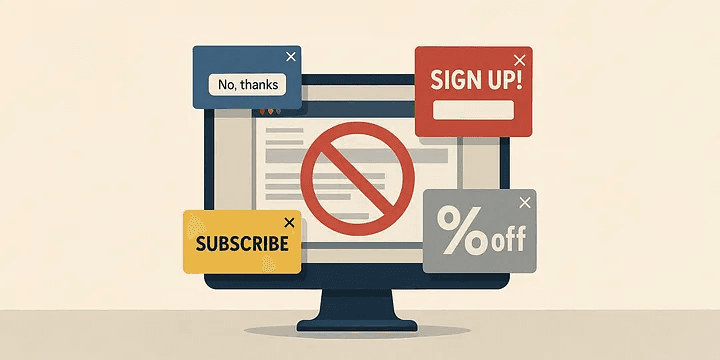
One of the most common conflicts in modern web design is the ongoing tension between user experience (UX) and marketing goals.
While one side prioritizes a smooth, intuitive, and respectful journey, the other focuses on conversions, data capture, and business impact. And perhaps no element embodies this conflict more clearly than the humble pop-up.
Press enter or click to view image in full size
Ask a UX designer, and the response is typically blunt:
“They interrupt flow, frustrate users, and increase bounce rates.”
Ask a marketer, and they’ll show you the numbers:
“They’re one of our best-performing tools for capturing leads and driving conversions.”
So… can both sides be right?
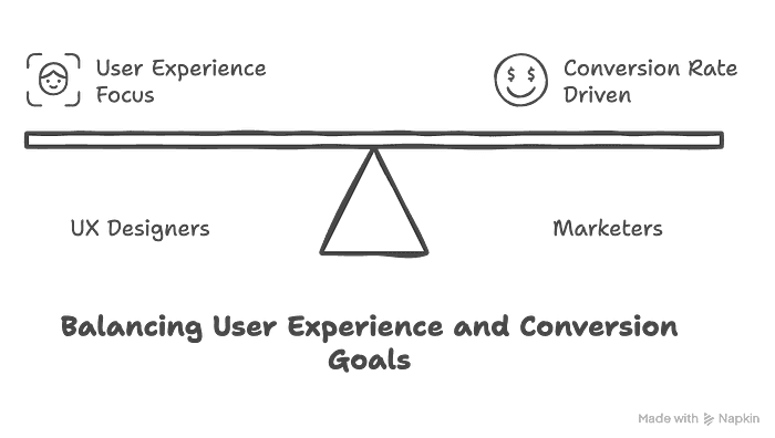
Why Pop-ups Are Problematic From a UX Perspective
Press enter or click to view image in full size
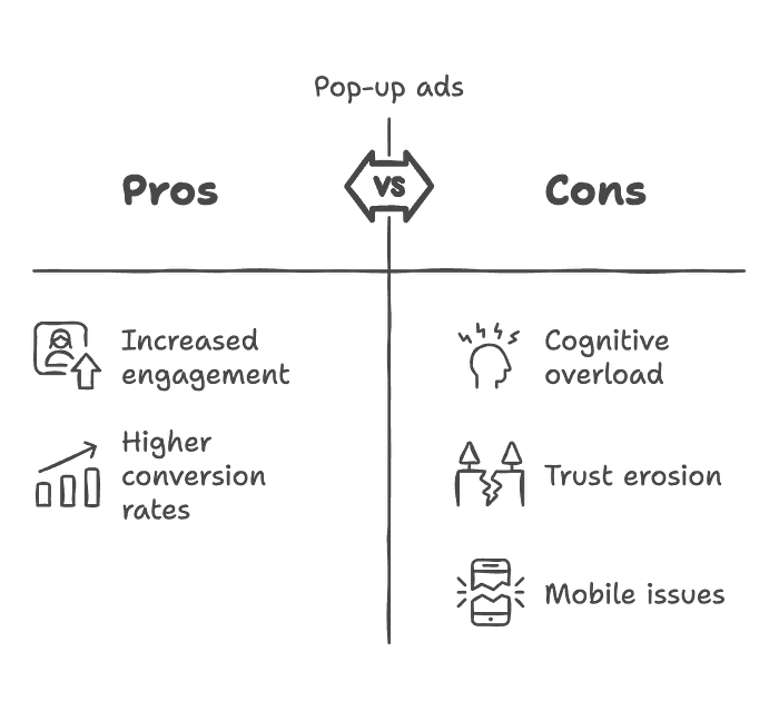
Pop-ups pros and cons
User experience is all about how effortlessly, confidently, and pleasantly a user can interact with a product. Poorly executed pop-ups break that flow in several key ways:
1. They add cognitive load.
When users are focused on a task, an unexpected overlay forces them to shift context. On e-commerce sites, this can lead to increased cart abandonment.
2. They can damage trust.
Prompting a user to share personal info — before they’ve even seen your content — can feel invasive. It communicates: “We want your data, not your attention.”
3. They often fail on mobile.
Poorly optimized pop-ups may be hard to close or render incorrectly on smaller screens. This not only frustrates users but also risks search engine penalties, as Google considers intrusive interstitials a ranking issue.
📌 Case Example:
A fintech startup initially showed a full-screen pop-up on the homepage to promote a campaign. During usability testing, 40% of users abandoned the site because they couldn’t easily close the pop-up. After switching to a scroll-triggered pop-up on the second page, bounce rates dropped to 15%.
Marketing Reality: Pop-ups Convert
On the marketing side, pop-ups are one of the most effective low-cost tools for growing audiences and increasing sales.
Press enter or click to view image in full size
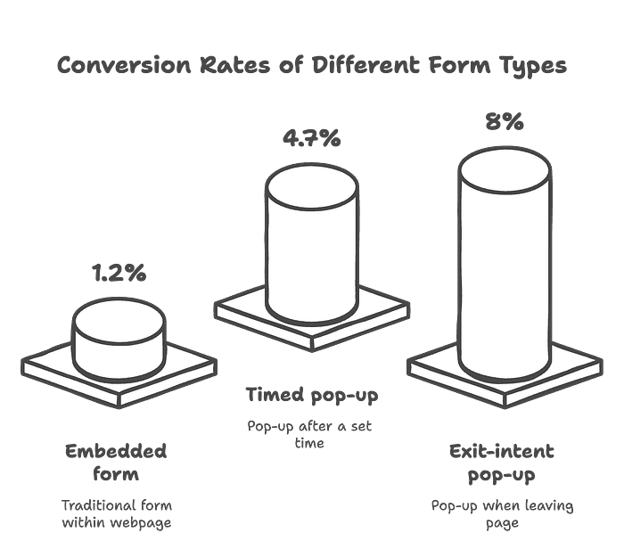
1. They boost list growth.
Compared to embedded forms, pop-ups can drastically improve conversion rates:
Embedded form: ~1.2% conversion
Timed pop-up: ~4.7%
Exit-intent pop-up: ~6–10%
2. They support user segmentation.
Pop-ups can be tailored based on user behavior. For example, returning visitors may see different offers than first-time users.
📌 Case Example:
An e-commerce store implemented an exit-intent pop-up offering 10% off to users who added items to their cart but didn’t check out. In an A/B test, the conversion rate increased from 3% to 6%.
Can We Just Ditch Pop-ups Entirely?
Some brands choose to do just that — especially those seeking a more premium, uninterrupted experience. Alternative methods include:
Press enter or click to view image in full size
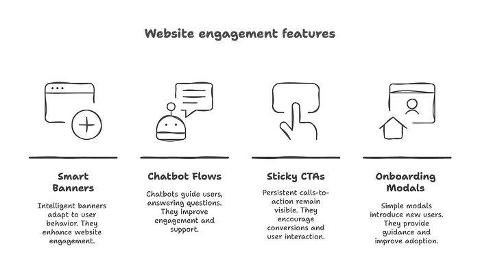
Smart embedded banners
Chatbot engagement flows
Sticky call-to-actions
Lightweight onboarding modals
But let’s be honest:
👉 None of these options match the raw, direct attention that pop-ups command.
The Middle Ground: UX-Friendly Pop-up Strategies
The solution isn’t to ban pop-ups but to design them responsibly — combining UX best practices with marketing intent.
What good pop-ups have in common:
Press enter or click to view image in full size
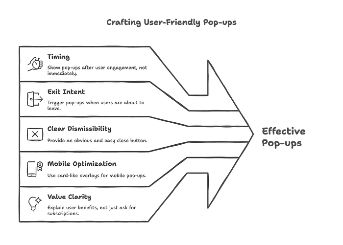
Crafting User-Friendly Pop-ups
Timing: Don’t show immediately — wait for user engagement.
Exit intent: Trigger only when users are about to leave.
Clear dismissibility: Always provide an obvious and easy close button.
Mobile optimization: Use card-like overlays instead of full-screen takeovers.
Value clarity: Don’t just say “Subscribe”; explain what the user gains (e.g., “Get 20% off” or “Free guide”).
📌 Case Example:
A SaaS platform replaced a timed pop-up with a scroll-triggered card at 50% scroll depth. The CTA was value-based: “Want free access to our resource library?” The result: email sign-up rates rose from 3% to 8%.
Can UX and Marketing Be on the Same Side?
Absolutely.
Press enter or click to view image in full size
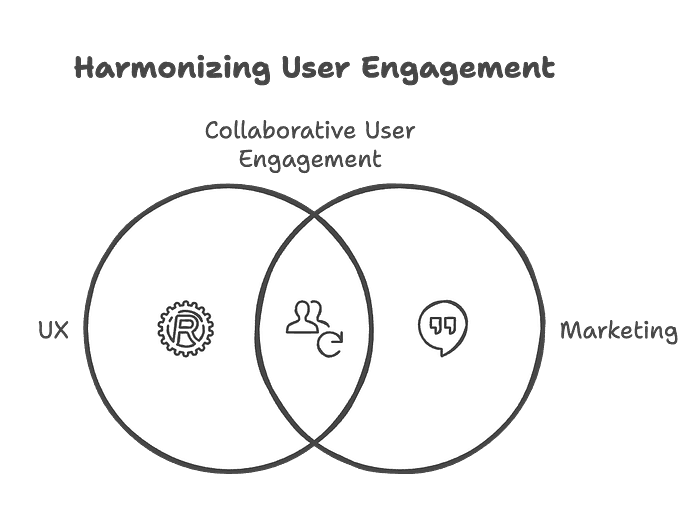
Collaborative User Engagement
Both disciplines aim to engage users — just from different angles:
UX wants to do it respectfully and seamlessly.
Marketing wants to ensure that engagement leads to tangible outcomes.
When UX and marketing work together, instead of against each other:
Overly aggressive tactics are avoided.
A/B testing validates both conversion and satisfaction.
The user feels respected, not pressured — and that builds long-term loyalty.
Conclusion: We Need Collaboration, Not Conflict
Pop-ups have become the villain of bad UX. But the problem isn’t the tool — it’s how it’s used.
With the right timing, thoughtful design, and clear value, pop-ups can be part of a frictionless, user-friendly experience that still drives business results.
Should pop-ups be banned?
Maybe the bad ones. But smart, ethical, UX-aware pop-ups? Those belong in every designer’s and marketer’s toolkit.